Overview
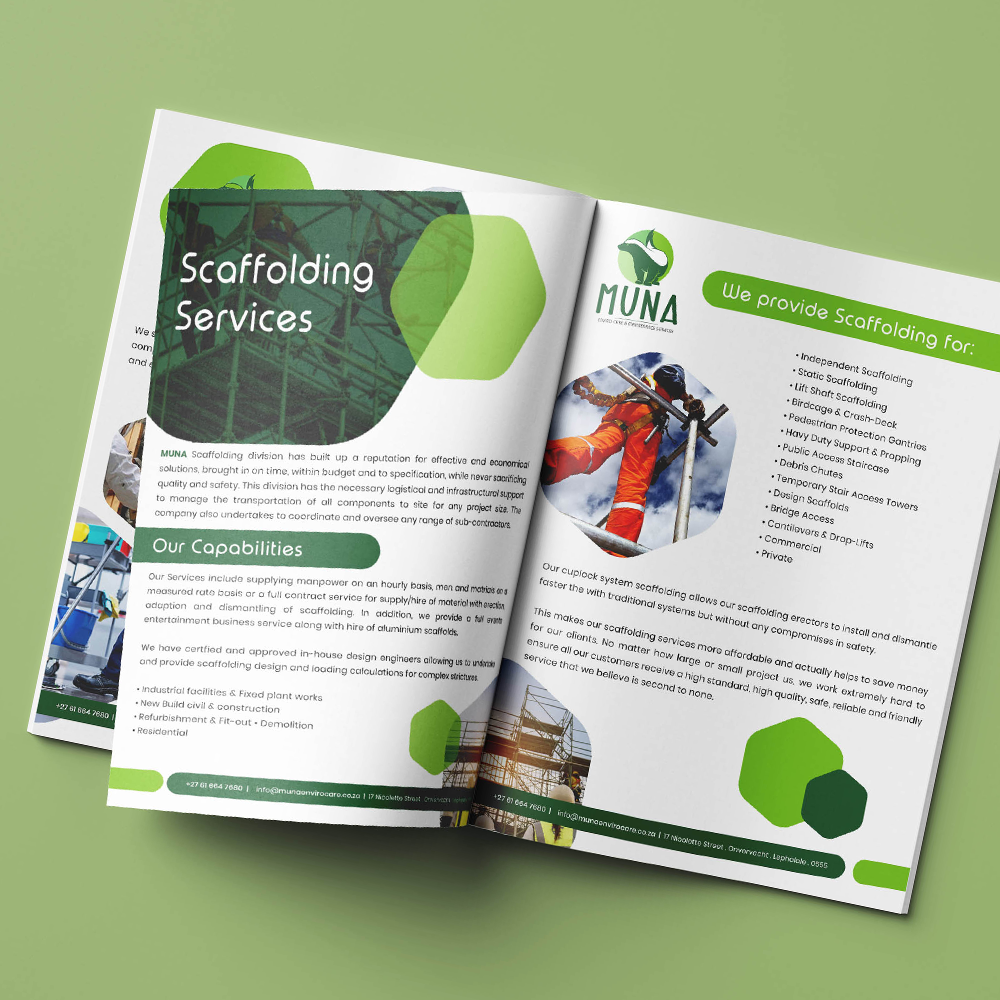
Muna Enviro Care & Maintenance Services is an environmentally focused service provider dedicated to delivering reliable care, maintenance, and sustainable solutions. The brand combines a strong connection to nature with a professional service approach, creating an identity that communicates responsibility, care, and trust.
Brand Identity Design
The MUNA brand identity was developed to reflect environmental responsibility, reliability, care, and professionalism. The visual direction draws inspiration from nature, using organic forms and a fresh green palette to establish a strong connection to environmental care while maintaining a confident and contemporary presence.
Details
- Logo Development · Brand Identity · Corporate Design
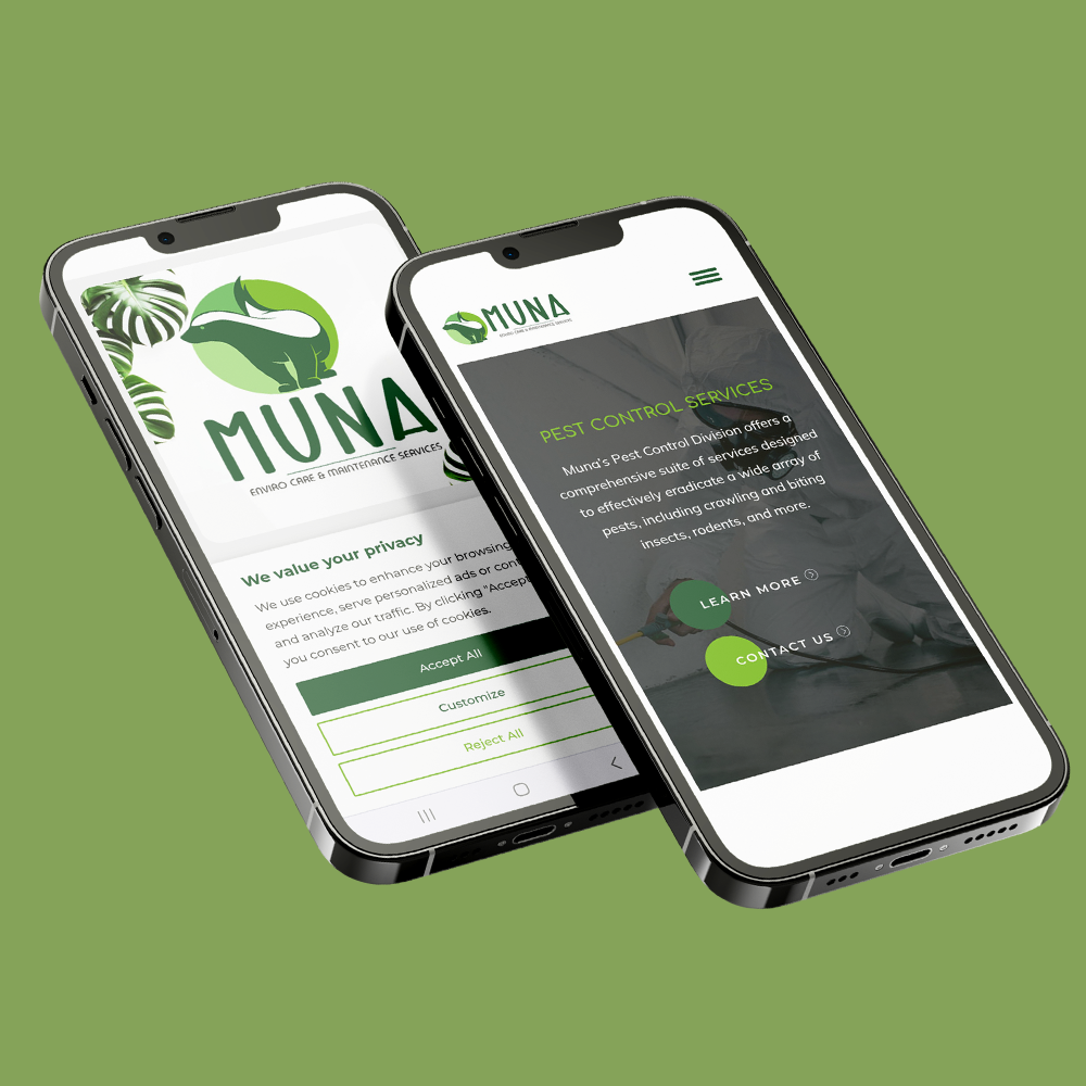
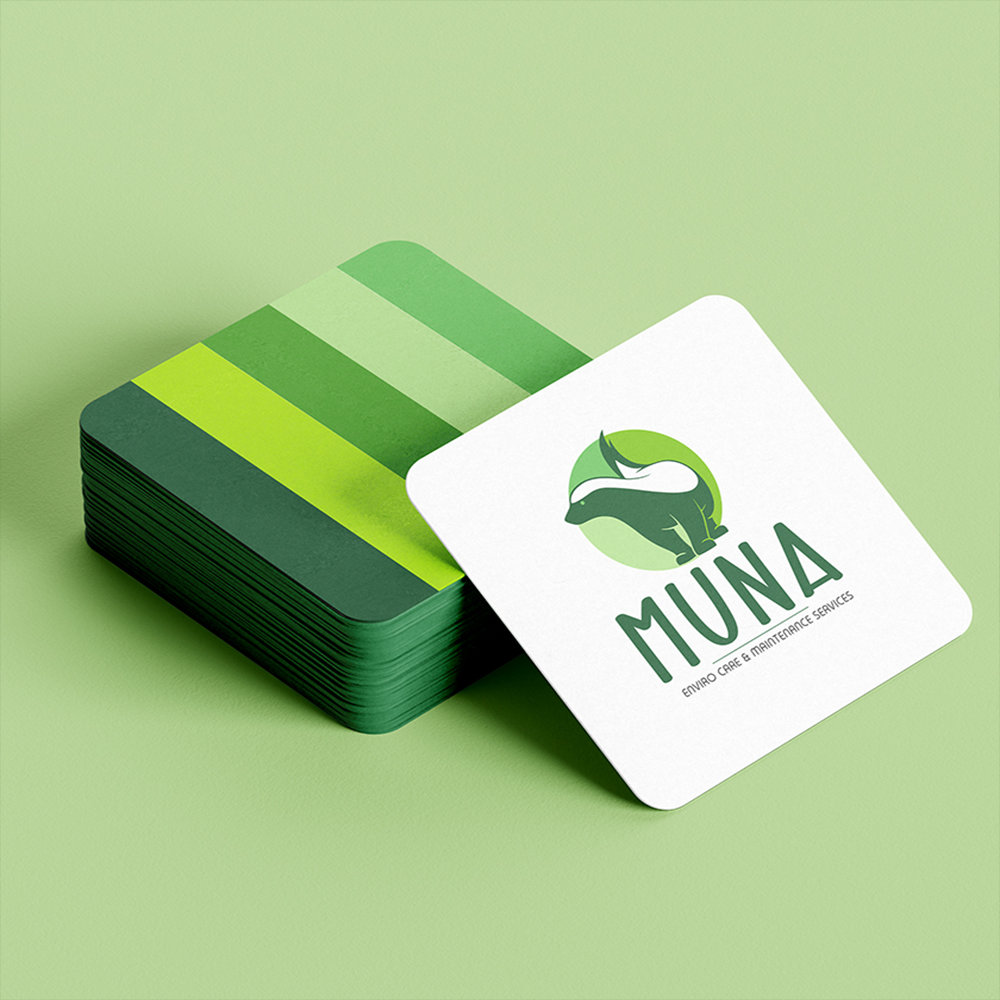
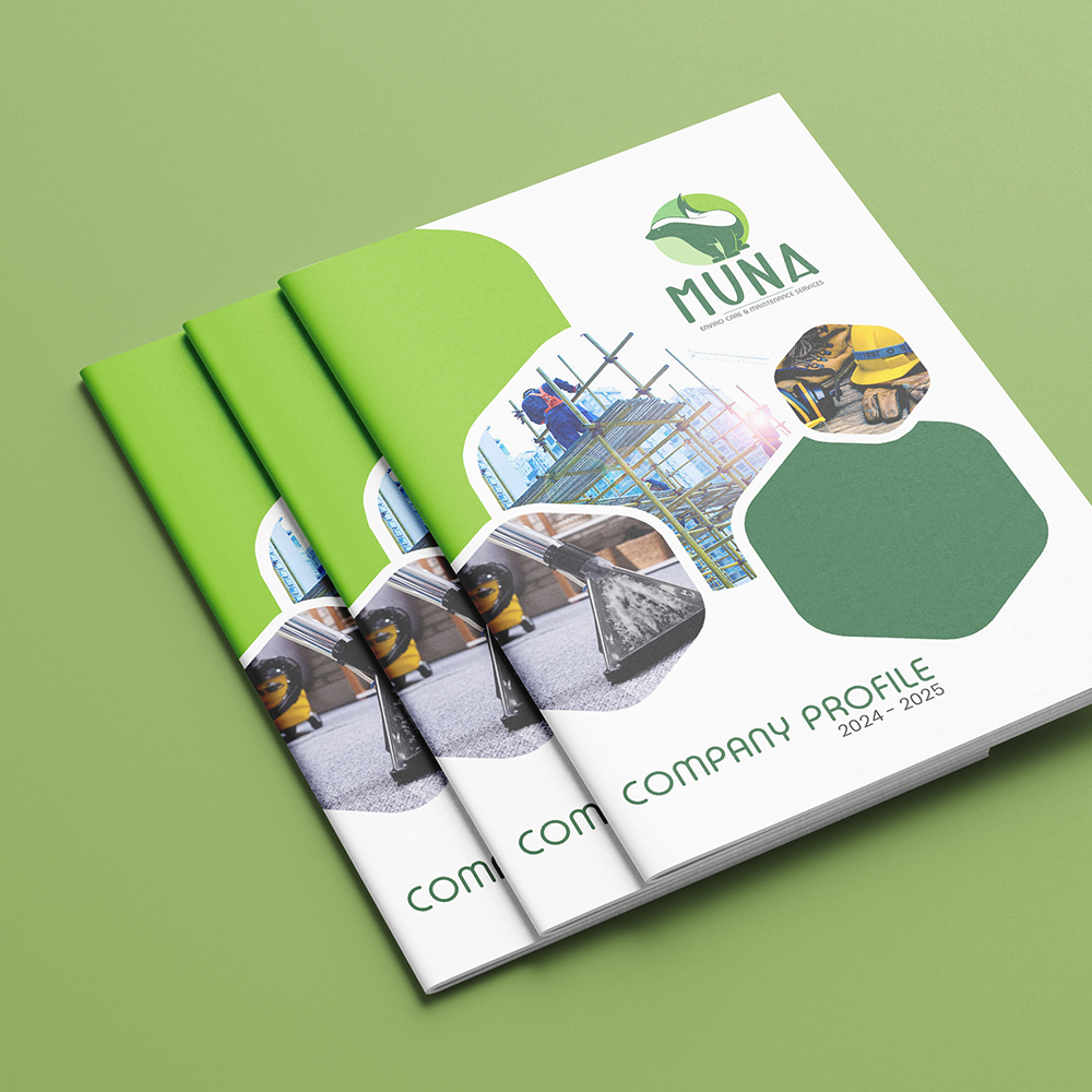
Designed for flexibility and recognition, the identity provides a cohesive visual foundation across uniforms, vehicles, stationery, signage, digital platforms, and marketing communications.
01. The Challenge
The objective was to create a distinctive identity that communicates MUNA’s connection to environmental care and professional maintenance services while remaining approachable and memorable.
The brand needed to balance its natural positioning with the reliability and professionalism expected from a modern service provider.
02. Creative Direction
The creative direction centred on nature, care, and sustainability.
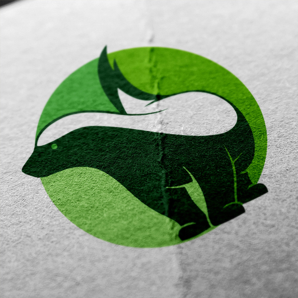
The custom emblem combines organic forms with a stylised animal-inspired silhouette, creating a memorable visual representation of environmental awareness and protection. A layered green palette reinforces the brand’s connection to nature, growth, and renewal.
Clean typography and a structured layout provide the balance, ensuring the identity remains professional and versatile across different applications.
03. Brand Personality
- Natural · Professional · Reliable · Sustainable · Caring · Responsible · Modern · Approachable
04. Visual Identity
The MUNA identity was designed to create a strong visual connection between nature and professional service.
The distinctive emblem provides immediate recognition, while the green colour system reinforces the brand’s environmental positioning. Supporting typography introduces a contemporary character that complements the organic visual language.
Together, these elements create a cohesive identity that is recognisable across both physical and digital touchpoints.
05. Typography
The typography was selected to complement the brand’s natural yet contemporary character.
The primary lettering provides a strong and confident presence, while the supporting typeface introduces a softer, approachable quality. This combination creates a balanced visual language that remains clear and distinctive across applications.
06. Project Outcome
The resulting MUNA identity establishes a recognisable, professional, and environmentally focused brand presence.
The combination of organic visual elements, natural colour tones, and contemporary typography positions MUNA as a dependable service provider with a clear connection to environmental care.